Showing posts with label Module 1; Research. Show all posts

Sunday, 6 January 2013

1.10 Design Process: Bold

I produced two bold designs of my wave pattern - the first uses an automatic No. 6 pen and acrylic ink on a sponged background (A4);  the second the edge of a 3 inch square sponge and acrylic ink (A3).  

1.1o.1
 1.10.2

I decided to develop the second image as I had already completed some design work on a similar image to the first in an earlier chapter.  

I copied the central section of the second image using my ink jet printer (A4 size).  Unfortunately, my colour cartridge was running out so the resultant image had no blue in it.  This is another one of those happy accidents as I quite liked the colour scheme of reds, yellows, pinks and oranges.

1.10.3

In the first image I cut the copied image into rectangles and rearranged them; overall I don't think this was successful although cutting the larger image into smaller rectangles highlighted some bold shapes within the individual rectangles which I liked, such as  bottom row 2nd from the left.   

1.10.4

I then cut an image into long narrow strips and off-set the individual strips, framing the central section.  Here I liked some of the combination of strips (3-5 and 7-9), both in terms of colour and shapes.  It has the feeling of a galaxy and supernovas to me.  

1.10.5

My third image is the A4 copy cut into diamond shapes, with the two vertical edges left intact to hold the shapes together.  I liked the repeat colours in this image.  

1.10.6

My final image is made up of 30 degree triangular segments re-arrange in an abstract manner, with some segments overlapping.  Again, the framed central portion is shown.  I liked the repeated red triangles in this image which I feel revolve around the central yellow area.  

This chapter has made me realise how cutting up an image can highlight specific new shapes and images within a defined section, which perhaps you may not have noticed in the larger overall image.  It has also emphasised how rearranging an image can create exciting new shapes or colour combinations.  


Tuesday, 1 January 2013

1.9 Design Process: Abstracted Fragments

I chose this option as my drawings are quite detailed, precise and realistic and therefore I felt this option may help me to loosen up.  I looked through my images from the coast and decided to continue on my theme of layers and looking through;  I came across an image of a theatre at Eastbourne and noticed in a small section of the photograph in the door glass that you could see abstracted reflections, one of which looked like a curved wave.  I  choose this shape to develop.  


1.9.1

1.9.2


1.9.3

These images (all 4x7 cm) are:

  1. Original shape extended beyond the rectangle.
  2. Extended beyond the rectangle with lines added.
  3. Within the rectangle.
  4. Lines rotated 180 degrees within rectangle and mirror image. 
  5. Image 3, with lines rotates 90 degrees and inserted twice.  
  6. Lines rotates horizontally and vertically, with 180 degree rotation.
  7. Lines rotated 180 degrees and extended beyond a faint rectangle.
  8. Original lines with no box.
  9. Lines and rotated 180 degree lines, no box.
  10. Lines, rotated 180 and 45 degrees with no box.
  11. Circles added.
  12. Circles and shading within rectangle.
  13. Circles, shading and patterns within rectangle.  
One of the surprising things to emerge from this exercise was the difference a rectangle (the traditional picture shape) can make to an image.  In one way it helped to define the overall shapes but in another it restricted the freedom of the lines and almost seemed to stop the 'movement' within the image.  

I then explored the image in a computer programme; I used Photoshop as I do not have a drawing or painting programme on my computer.  


1.9.4
  Clockwise from the top left are:

  1. Original scanned image.
  2. Liquify.
  3. Plastic Wrap.
  4. Polar.
  5. Zig-zag.
  6. Wave.
  7. Pointillise.
  8. Ocean Ripple.
The images produced by Liquify and Zig-zag are probably my favourite results.

I then went on to add colour, acrylic inks, to the image (8x14 cm).  

1.9.5 
  1.9.6

Clockwise from the top left:

  1. Equal amount of complementary opposites.
  2. Mainly harmonious colours with one area the complementary.
  3. Mostly lightly toned with one darker toned area.
  4. Similar colours across connected shapes.
  5. Complementaries, one higher proportion.
  6. Reverse of 5 above.
The use of the complementaries really made the opposite colour intense, this is particularly evident in the purple and yellow images; this is also true in the green and red.  The small darker tone in image 3 also looks darker when completely surrounded by lighter tones.

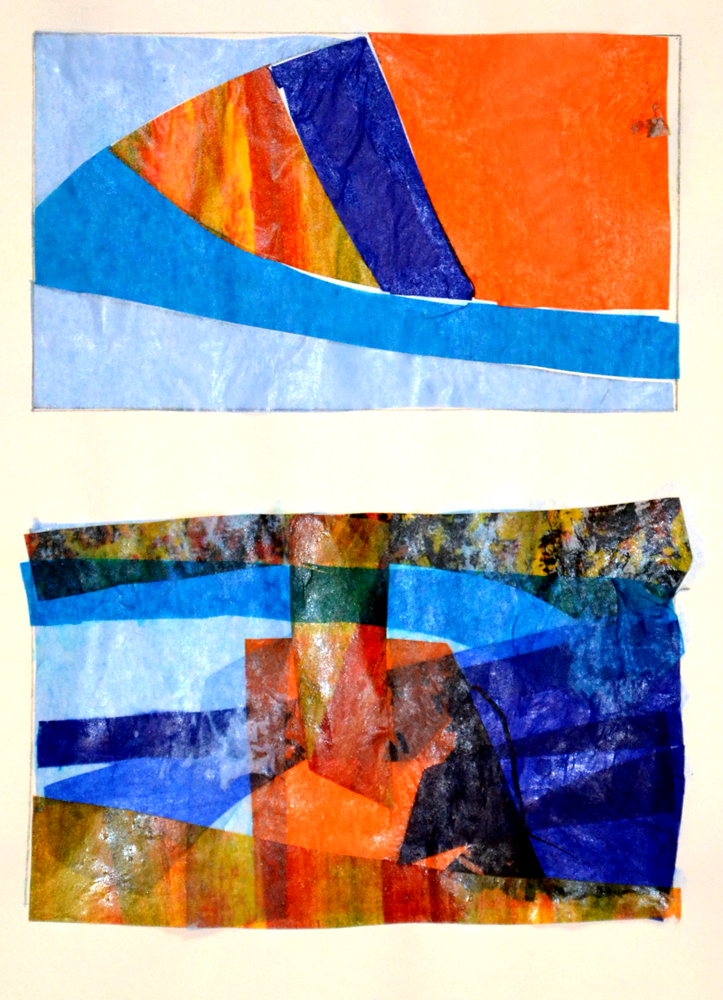
I continued the exercise and my theme of looking through and layers by using plain and patterned tissue paper.  

 1.9.7
 1.9.8
 1.9.9
1.9.10

The top image is the original lines with tissue shapes inserted.  I then used this to cut out multiple shapes of different tissue papers and reinserted them into the rectangle to form new abstract images; the last image is without the rectangle.  I particularly like the lower image on 1.9.7 and image 1.9.9.

As I liked the effect of these shapes. I produced a layered image of waves using one of the abstracted shapes and a new wave shape from one of my preliminarily sketches.  

1.9.11
From the top of the image the layers are a graduated acrylic ink wash; crumpled dyed muslin to give the impression of the foam produced at the top of waves; layers of the abstracted shape in both plain and coloured tissue papers; and, layers of the new abstracted shapes in blues and pinks.  The photograph does not bring out the lighter coloured tissue papers very well but overall I am quite pleased with the final image.  The main change change I would make is to reverse the pink colours at the base of the image, as the darker toned pink at the bottom is quite dominant, it draws the eye and stops the movement within the picture.  

My final set of images within this section are layering different papers, stitched lines and reverse applique, within the original abstracted shapes.  

 1.9.12
 1.9.13
     1.9.14
The top image is layered Amaretto biscuit papers in different colours, remains from over-indulgence at Christmas, but I really liked these papers and the colours and wanted to see what effect they would create if layered and cut away.  The middle image is a selection of papers in complementary colours.  The lower image is layers of patterned origami papers; I really like the contrast between the small and large patterns created in this image.  

This chapter has surprised me on the range of images that can be created from a fairly simple intersection of lines in a small cross-section of one photograph.  It makes you wonder how much diverse work could be produced from one single original image!  

Saturday, 15 December 2012

Review of Project

I started to lose some inspiration from my subject, was not happy with the quality of my work and ask Sian for some feedback on my progress so that I could determine my way forwards.  Sian questioned whether I had been thinking about the direction of my theme and suggested I review all my work and posts to look at my strengths, where my passions lie and enjoy those aspects of my results that have worked. 

One comment that really made me think is my need to present solutions rather than treat the exercises as an investigative journey.  Sian also used one or two quotes from my blog to help me decide on my future progress and I extended this by reviewing all my posts and picking out those aspects of my work that I have really enjoyed. 
  • looking through the broken shell
  • rock pools with mini waves; looking through the layers
  • reflective, translucent light, water reflecting the light
  • waves, gradually fading
  • overlapping translucent layers, producing different tones and new shapes within shapes
  • sun-ray effect of folded dyed fabric; the effect where the resist has left interesting patterns and ghost-like effects of the object
  • gradually faded blue pattern; transferred image fades the more times it is used.
I then thought about these words and how I would progress for about a week and rather than repeating the exercises, I decided to explore those themes I have enjoyed in my work in the next chapters of Design Process and Towards an Embroidered Item, adding addition exercises where needed.     

Friday, 23 November 2012

1.6 Fabric Dyeing (2)

I decided to try dyeing some muslin, again wrapped around sticks, to try to increase the colour penetration.  These were all dyed in my colour scheme of blues and turquoise.  My thoughts at this stage for the final piece, remain some form of translucent layed image depicting my childhood memoirs, with a wave background.    The penetration of the dye was much better this time particularly in the first image.

#1.6.8

#1.6.9

#1.6.10

#1.6.11

#1.6.12

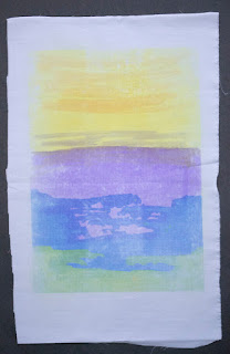
After trying the dispersal dyes, I thought I would prepare some backgrounds for the next chapter, using transfer dyes.  I painted the transfer dyes onto layout paper (A4), working quite quickly and freely to create loose seascape images from memory.  I quite like the pooling of the colour as the paper winkled under the wet dye as it has an almost watercolour effect. 

#1.6.13

#1.6.14

#1.6.15

#1.6.16

I then transferred the images onto polyester cotton.  Due to the cotton content of the fabric the images transferred lighter than the original, however, I quite liked the more subtle colours.   

#1.6.17

#1.6.18

#1.6.19

#1.6.20
  
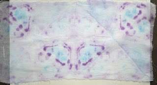
I then tried some experiments dyeing different synthetic fabric strips.  I prepared another range of transfer papers (A5).  


#1.6.21

I then stitched together three fabric strips and transferred the dye. 

#1.6.22
In the image above, the top strip is an Eton II Taffeta lining (100%  polyester); the middle strip an acetate white satin; and the middle strip a plain synthetic organza. 

#1.6.23

In the image above, the top strip is a polyester (65%) cotton (35%) lawn; the middle strip a nylon voile; and the bottom strip a polyester Dupion.  The colours are more vibrant than both photographs above indicate and the nylon voile has taken on more colour than is apparent.  There is the 'happy accident' of leaving the iron too long in one place on the last strip but it adds another dimension to the image (reminds me of the Francis Bacon quote 'all painting is an accident').   

To finish the transfer dyeing I printed one image multiple times across a strip of 100% polyester to give the effect of the sea.  Whilst this worked quite well with the transferred image fading the more times it was used, sometimes the multiple transfers also removed some of the transferred dye from a previous pressing.  

#1.6.24

I really enjoyed using the transfer dye as the end result is much more controllable.  I will continue to experiment with dyeing, perhaps using the immersion dyes first to provide a general colour and then using the transfer dyes (although there would have to be a careful choice of fabric/dye products for the desired outcome to work). 

Saturday, 10 November 2012

1.6 Fabric Dyeing (1)

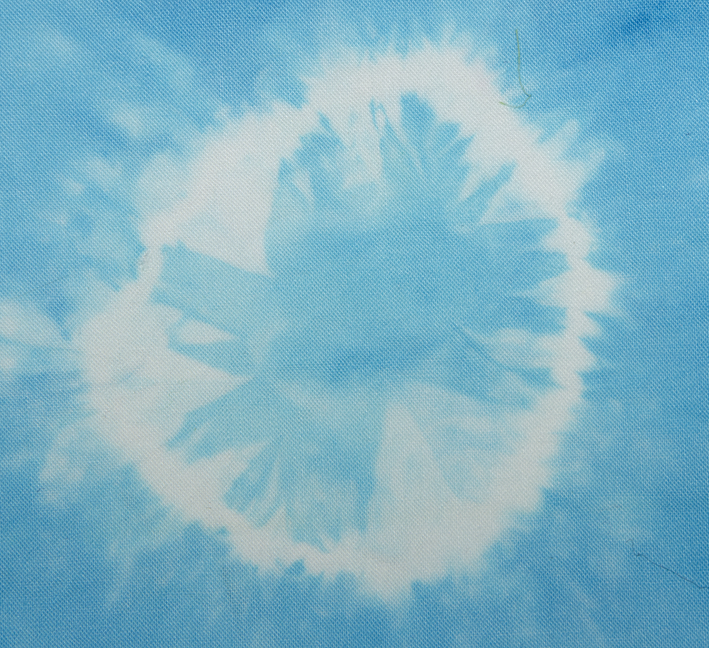
I have never dyed my own fabric before as the thought of all the mess has always put me off so this is the first attempt of a 'dyeing virgin' (that doesn't quite sound right!).  I decided to start out by using cold water dyes on a small scale.  I prepared a range of fabric pieces - cotton lawn, muslin, hessian, etc., - by folding; tying around bamboo shewers (Shibori style); insert pebbles/shells and tying; and, plain squares.

#1.6.1
I prepared four dyeing baths - red, blue, yellow and green (self-mixed).  I then immersed the fabric pieces in the baths and waited for the results.  I was surprised that after 45 minutes immersion the dye had not penetrated some of the tied fabrics more.  Where the remaining white was too dominant I dipped immersed the fabric into another colour to dye the white. 

The results below are the flat fabric pieces.  Clockwise from the top  - cotton open weave , a 100% synthetic fibre fabric, two hessian fabrics.  The cotton open weave took the dye the best; the synthetic fabric has turned a very light pink (not quite evident in the photograph); and, the both hessian pieces have taken on a light shade of green and yellow.

#1.6.2
These are the folded fabrics.  I really like the yellow pleated fabric which has produced a sun-ray effect and also the gradually fading blue pattern.

#1.6.3
The next set are the fabrics tied around the bamboo sticks.  All have been re-dyed with a second colour as the dye did not pnetrate the fbric very well. 

#1.6.4
The piece below shows the change when a second dye is taken.   The end green patches were originally dyed blue and turned green when an overall second immersion in a yellow dye was applied. 

#1.6.5
The final pieces are perhaps my favorites.  In keeping with my theme I inserted a scallop shell (green), pebbles (blue) and a range of shells (red) and tied them tightly into th fabric.  I really like the pattern and effects the shells have left where they have resisted the dye.   

#1.6.6a

#1.6.6b

#1.6.6c

#1.6.6d

#1.6.7


The details above show how the resist of the shell, pebbles and string have left interesting patterns and ghost-like effects of the objects. 

Friday, 26 October 2012

1.4 Shapes

When looking at my images of the coast and seaside towns the initial shape which caught my eye was domes.  Whilst this may seem strange, I think this comes both from the era when seaside began growing in the late Victorian period, when all things exotic were popular, and from the area I visited which is close to Brighton and the India-inspired Royal Pavilion.  Domes seemed to be everywhere, on roof-tops, as lamp-posts, on the pier, etc.  

#1.4.1

I pull together some drawings of domes to look at the various shapes.

#1.4.2

I also had some pictures of the Easter Cathedral in Russia and used one of these domes and associated shapes to produce a lino cut and tried printing some images onto paper.

#1.4.3

However, this shape did not seem to meet the brief of having enough inverted areas to develop the image.  I therefore looked back through my pictures and began to draw from a photograph the breaking wave shape.  I simplified the shapes to make a line drawing so that I could concentrate only on the shape of the wave.

#1.4.4

I made a tracing of the drawing and a smaller card template of the shape.  I then started some of the exercises to look at the effects on A5 paper and this is a college of some of the images.    

#1.4.5

I then produced a lino cut printing block of the image and began printing on both white and coloured A4 paper backgrounds.  I also cut up some of the images and re-arranged then to produce a new pattern.  the pencil drawings are my original images for the shape.   

#1.4.6

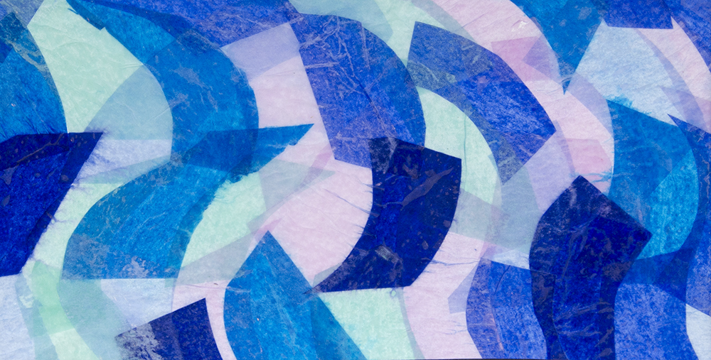
I particularly liked the effect of the gradually fading waves as the block is used without re-inking. I then used the curved wave shape and produced some shapes in tissue paper and glue them to cellophane, overlapping them to get different tones, as in my rock pool images earlier.  

#1.4.7

This over-lapping of transparent layers is something which quite interests me so could become part of my final project.

I need to think through how it will work when my overall design for my final project is better formed in my mind.  I have an idea of background layers of different images and shapes, with some form of ethereal images, based on my personal experience as a child at the coast.  I am also thinking at this stage of a narrative in my final image (as it is a wall panel), being alone as a child, how as we get old we become alone and, following a visit to Hastings where I saw many young people sitting alone, interfacing with their technology (iphones, ipads, etc.), rather than enjoying the beach and being part of the community.  All this is at a very early stage as I work through the research project. 

I produce another layered image using more geometric shapes, just because I enjoy the effect it produces - different tones which produce new shapes within shapes.   

#1.4.8